Before
On the first image I cropped out my model and made the whole background black to remove unnecessary distractions from the image itself, I also put the title "Youth" in front of her arm to add a nice layer.
On this page I asked for some advice to get a different perspective from peers, I was informed that usually in magazine design, you want the viewer to have their eye focus in the middle of the page as it's easier to analyse the double page spread and view information better. So I flipped my model's image horizontally and zoomed it in as there was unwanted negative space.
As for the text, I added columns to make it look neater and swapped the big quote onto the left since we read from the left.
I didn't like this basic 'boxy' design and changed the text and images. I made the shoe image have a round frame and make the text go around it. I also changed the quote on my main image and used colours e.g. purple, pink blue in order to make the whole double page cohesive to the rest of the pages.
I was really struggling to make this double spread work as my initial ideas was to dedicate it to the quotes that I got from people expressing their feelings and experiences during the pandemic. Unfortunately I couldn't find a creative and aesthetically pleasing way to present it and dropped that idea as it wasn't working at all.
After - Current preview
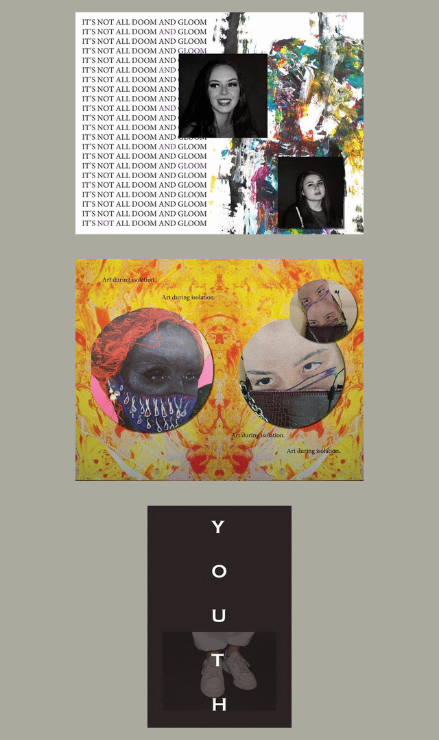
This is my current/updated version of the 'magazine' / look-book that involves all of my primary images and art to create a nice contrast through out the pages. I really like the outcome so far and my last step is to write up the article explaining the experiences of our youth during the pandemic.


Comments
Post a Comment